How Understanding a Brand Mission Will Make You a Better Designer

As a designer who’s recently graduated from university, I’ve spent the past two years as a designer working for the tech startup Veeqo and was really focused on improving my design skills. I was the first person employed by founder Matt Warren and with the company being a startup, I’ve been part of a lot of work that is outside of design and originally out of my comfort zone.
Being involved in client discussions around customer personas, empathy maps, and brand missions has vastly improved my skills as a designer. And whether you’re a freelance designer or working within a company, having a fundamental understanding of these topics can help you advance your skills and strengthen relationships with your clients.
Before attending meetings with our clients, I would often prepare by researching industry leading brands including Shopify, Mailchimp, and Dropbox. Not only do these companies boast brilliant design, but their personality is exactly the right mix of weird and wonderful as, Anna Pickard from Slack explains here.
When I started to take a close look at the effortless but effective language these companies use, I realized it all leads back to why they exist — their brand mission. A brand mission is essentially the problem a company aims to solve with their service or product. They believe their ideas matter, and how they plan to solve the major roadblocks facing their users.
Once I realised this, it was clear that their brand missions influence everything — from the the language in their marketing copy to the smallest of design details in their pixel perfect interfaces. The result of this mixture is a consistent brand that communicates a clear and cohesive message. See Dropbox below for a great example of this.

It’s important to remember that whether you’re creating a whole new site or just designing a standalone landing page, your clients are looking to build their online reputation based on the core foundations of their existing brand. In order to achieve this, your design should reflect their overarching mission and employ the specific voice that embodies and personifies their brand.
Creating an empathy map
If you ever studied brand design in school, the question “What are the benefits of what you’re trying to sell?” is likely etched into your mind. However outside of the controlled environment of a classroom, it becomes more difficult to answer that question — especially when it’s applied to a real situation that involves a paying client’s site.
When I started working with my firm, I didn’t quite understand the benefits, or what the emotional and physical rewards of using our product, were. Our audience consisted of online retailers and I didn’t have a clue what it was like to sell online or what problems our audience frequently encountered in the process of doing so.
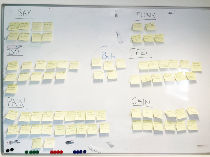
For the team to get a better understanding of our audience before diving into the design process, we created an empathy map. An empathy map allows you to put yourself into the shoes of your potential users to better understand the thoughts and feelings that motivate their actions.
We started by thinking about four key elements from the point of view of our potential users. What would we say, do, think and feel if we were an online seller? Which was then followed with thinking about the pains (what problems they have) and gains (what ideal outcome do they want) of selling online.
Our potential users have a lot of different needs so to make it easier, we split them up into segments and grouped them together to make mini customer personas. We start with their job role, a bit about their personal background, how many people work for their company, and what stores they sell on. Then finally, we gave them a name so we always know who we’re talking about.
We took 20 minutes to ask ourselves a whole lot of questions and answered them from our user’s point of view. Here’s a sample of the questions we asked:
What’s in their daily routine?
Lots of time consuming jobs that could be automated or at least made easier by using a product like ours. For online sellers, it’s all about ensuring that they get their orders out on time and that they can keep their customers happy.
What would their attitude be towards our product or an alternative?
For one of our personas, we found that they might think that they don’t need our product and stick to their usual routine. That means it’s our job to persuade them that we can save them time and effort.
Is what they’d say in public, the same as what they would think in private?
People want to believe they’re making the right choices for their business. So if they think they’re not 100% happy, chances are they’d actually tell their friends in public that it’s fine and then try to persuade themselves that it is.
These questions made us think deeper and gather all our thoughts on the empathy map to then find our main insights.
Here’s what we found:
- We need to get people to trust us. Their businesses are their lives and it takes a lot to put trust in a new company to help them take care of it.
- We don’t want to tell anyone how to run their business. We shouldn’t be telling people how to do something, but rather how we can try our best to help them.
We want to make life easier. From our empathy map, we found there’s lots of time-consuming jobs our product could automate. (This became part of our own brand mission, but more on that later).
We gathered all of this new information and began writing key messages next to our product’s core features. A great example of an empathy map that really helped us with the process was this one from Design for Delight.

How we used our findings to increase our own conversions by 35%
As mentioned before, it’s especially helpful for designers to be involved in discussions early on to help them understand and achieve the client’s goal. There’s nothing worse than having a brief placed on your desk from someone in marketing and having to piece it together yourself. But when it came to designing our own homepage, the task of creating a headline and subheading seemed to be outside of my scope as a designer.
This siloed style of thinking can lead to a divide in some companies and even cause tensions between departments. A good guide on how marketing and design can work together was put together by Creative Bloq and says that “rather than thinking of design and marketing as yin and yang, both departments should be focused on understanding the consumer they are targeting.” Luckily our entire team was on a level playing field thanks to our previous experiment with the empathy map.
The findings from our empathy map led us to consider changing our tagline. Our original brand tagline was “Multichannel order and inventory management”, but our empathy map experiment helped us get into the minds of our potential customers and realize that this style of language probably didn’t resonate with their personal needs and challenges. That was where ‘Make Life Easier’ came from, it felt like such a bold generic claim at first, but it summed up what Veeqo does best for people. The change was the right one and resulted in a 35% increase for unique visitors to free trials.
Over the few weeks that followed this experiment, I realised how important a brand identity and mission is, and how it’s much more than just a logo or a nice colour palette. All of the elements of your site — whether it’s the design or the language — should be working together to create a consistent and recognisable experience for your users.
In summary, not only is it important for a designer to involve themselves in brand meetings, but it’s equally important that there is an orderly process between departments and that everyone is aware of the full brief. This will allow you to better understand the site you are working on, plus the potential pains and gains of the people who would visit it. This will not only have a positive impact on the designs you create, but will help knowing everyone is striving towards the same goal.


